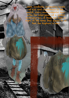
This shoot was done when i was about half way finished with my final collection and i needed to present a set of photos for a class. i figured it was a good idea to use the collection i had been working on in the pictures as it was a collection i was very familiar with and knew exactly what i wanted. with the help of Yanny Tokyo (photographer) and friends Raphael Kosterski & Cici Von Crypt (models) i set out to bring my collections story to life. I still hope to do more at some point so that i may show the rest of the collection in the same way.
Friday, 3 June 2011
Tuesday, 24 May 2011
Urban Nomad Revisited
This term i was given the opportunity to revisit my sketches for my final collection. I was pleased with my previous sketches from the collection, but found a new excitement in the idea of redoing them with my graphics tablet. I find that i really enjoy working with my tablet and am growing more and more comfortable with it, and as a result have produced new sketches showing my "Urban Nomad" collection, that i am quite happy with.
Thanks to the help of one Mr Yanny Tokyo (photographer), i have also done a pretty exciting photo shoot with some of the garments. I will post these pictures as the show gets closer. Dont want to reveal TOO much just yet.
Thursday, 28 April 2011
GRAPHICS TABLET!
Every term i try to change how i do my illustrations. i feel that this gives me new ideas as to how my work can be not only drawn out but thought about. i figure that while i am still a student it is a good idea to experiment and try to find new ways of working so that your options for a standard comfort level are expanded.
This term i invested in a graphics tablet for my CAD class. i must say i was a bit hesitant at first in my purchase, but after using it, i have absolutely fallen in love with it. i feel that my illustrations have always improved over time, but now have been boosted 10x due to one little digital drawing pad. i cannot wait to do more work with it and see what i come up with, but for now here are two drawings i did with it.
*NOTE* these designs are not my own, but rather those of Alexander McQueen. i only used them as reference for my sketches.
Sunday, 6 March 2011
Urban Nomad - Project 4
Final Collection Mood Board
For project 4, we had to illustrate our final collection that we have been working on for 20 weeks thus far. My final collection is called Urban Nomad and is based on survival and sustainability in a post apocalyptic world. The story is based on surviving men and women rebuilding society and civilization. Most of the garment shapes are androgynous as the people in this new civilization are not limited by gender or sexuality. With mostly simple shapes that can be worn or perceived differently, the collection has a sense of raw freedom with a hint of primitive tribalism.
Black is the New Black - Project 3
Project 2 for final portfolio was a styling project. we were to come up with a theme/concept and style a photo shoot/story using garments we have made in the past. i went through various ideas and the more complex ideas quickly went out the window when i looked through the images takes with the plain white background in my bedroom. with the help of my boyfriend (photographer and model in the last two pages) as well as my classmate (female model in 2nd & 3rd page), i was able to convey the same mood and feel i wanted from the beginning but in a simple and somewhat raw way. there is no underlying meaning behind the title or theme, but Black is the New Black is titled as such simply because all of the garments i used were black. don't over analyze it...just enjoy.
Petrol Noir - Project 3
(Left - Mood Board. Right - Concept Board)
(Left - Design Board 1. Right - Flats)
(Left - Design Board 2. Right - Flats)
(Left - Design board 3. Right - Flats)
Petrol Noir was a collection/project created for my womenswear course at Uni. the brief was 20th century and each student was to design based on inspiration gathered from a certain decade. My decade of choice was the 80's. I chose this decade so as to show others a different side of the 80's that they may not be used to.
Many think of the 80s as a time of bright colours, big hair, accentuated shoulders, and really horrible synth-pop music. i decided to go a different direction in my inspiration and looked at the Exxon-Valdez oil spill that happened in alaska. i decided it correlated with the recent rise in oil spills happening throughout the world and also allowed me to further build on my own design philosophy of life vs. death and the natural struggles we go through in life. Of course my work was criticized by some peers for not being "80's enough" aka no bright colours, no hideous fabrics, etc, but over all i was very pleased with this collection and felt i made my own personal statement. those who dont understand it are simply those who do not wish to understand and those without the ability to open up their own imagination in order to break free of their comfort zone.
Subscribe to:
Posts (Atom)


